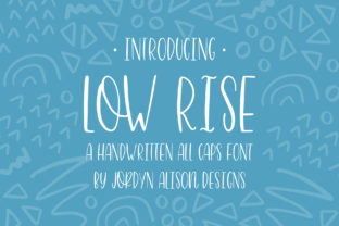
Low Rise: A Sans Serif Font Full of Positive Energy
Low Rise isn’t just another sans serif—it’s a quiet spark of optimism built into letterforms. Designed with delicate, intentional curves and balanced proportions, it carries warmth without sacrificing clarity. It doesn’t shout; it smiles. That subtle lift in the terminals, the gentle swell of the ‘a’ and ‘e’, the open counters—these aren’t decorative flourishes. They’re functional choices that invite readability, approachability, and emotional resonance. For creators who value both craft and connection, Low Rise offers a rare combination: typographic integrity paired with genuine human tone.
Why Designers Reach for Low Rise
Designers choose Low Rise when they want typography that supports—not overshadows—their message. Its x-height is generous, making it highly legible at smaller sizes, while its moderate contrast between thick and thin strokes ensures visual comfort across long passages. Unlike ultra-minimalist fonts that can feel sterile, or rounded fonts that risk looking childish, Low Rise strikes a grounded middle ground: friendly but professional, modern but not cold.
It works especially well in contexts where trust and warmth matter—think wellness brands, educational platforms, community newsletters, or small business websites. One freelance designer recently used Low Rise for a local yoga studio’s rebrand: pairing it with soft linen textures and muted earth tones created an immediate sense of calm and intention. Another educator used it across printable lesson plans and student-facing slides—reporting fewer readability complaints from learners with dyslexia, thanks to its open shapes and consistent rhythm.
Creative Applications Across Mediums
Low Rise adapts gracefully—from screen to print, interface to illustration. Here’s how different users bring it to life:
- Bloggers & content creators: Use Low Rise for headlines and pull quotes to add lightness and personality without compromising scannability. Pair it with a neutral body font (like Inter or Lato) for contrast and hierarchy.
- Small business owners: Apply it to packaging labels, storefront signage, or social media banners where first impressions count. Its curves soften product photography and make handmade goods feel more personal.
- Educators & course designers: Leverage its clarity in slide decks, handouts, and learning modules. Avoid all-caps usage—instead, use sentence case with thoughtful line spacing to support focus and retention.
- Freelancers & agencies: Build brand guidelines that specify Low Rise for primary headings and call-to-action buttons. Define exact weights (Light, Regular, SemiBold) and spacing rules—this keeps client deliverables consistent, even across multiple designers.
Real-World Style Variations
You don’t need to reinvent the wheel to make Low Rise feel fresh. Small, intentional shifts change its character:
- Color & weight play: Try Low Rise SemiBold in deep charcoal on off-white paper for a grounded, editorial feel—or in sky blue on a clean white background for a breezy, digital-first vibe.
- Letter-spacing adjustments: Slightly tighter tracking (–10–20 units) adds cohesion in logos or short headlines. Looser tracking (+30–50 units) enhances airiness in hero sections or invitation designs.
- Contextual pairing: Combine with a structured monospace (like JetBrains Mono) for tech-focused blogs, or a warm serif (like Cormorant Garamond) for storytelling sites. The contrast highlights Low Rise’s friendliness without diluting its voice.
Making It Work for Your Audience
Who you’re speaking to determines how far you lean into Low Rise’s expressive qualities. A pediatric clinic might use its Light weight in pastel palettes for patient handouts—emphasizing care and gentleness. A sustainable fashion label could set product tags in Low Rise Regular with generous line height and natural fiber texture overlays—communicating authenticity and ease.
The key is consistency—not repetition. If you use Low Rise for your website’s H1s, apply the same weight, size scale, and spacing logic to your email subject lines and Instagram story text overlays. That predictability builds recognition. And when adapting for accessibility, stick to WCAG-compliant color contrast (4.5:1 minimum for body text), avoid justified alignment, and always test readability on mobile screens before finalizing.
What to Avoid (and Why)
Low Rise shines when used with restraint. Steer clear of:
- Overly tight line heights—its curves need breathing room, especially in paragraphs. Aim for 1.5–1.7x line height for body text.
- Heavy distortion or effects—drop shadows, extreme skewing, or gradient fills undermine its natural balance. Let the type do the work.
- Mixing too many weights—using Light, Bold, and Black in one layout can fracture hierarchy. Stick to two or three weights max, and assign each a clear role (e.g., Regular for subheads, SemiBold for main headlines).
Also, resist the urge to force it everywhere. Low Rise isn’t ideal for dense data tables, technical documentation requiring high precision, or environments with low-resolution displays. Know when it serves—and when another typeface better fits the task.
Getting Started Thoughtfully
If you’re exploring Low Rise for the first time, start small. Replace just one element—your newsletter headline, your portfolio site’s “About” section title, or your Canva presentation’s cover slide. Observe how it changes the tone. Does it feel more inviting? More confident? More aligned with your values?
Then expand deliberately. Create a simple style guide snippet: define your primary weight, default size, recommended line height, and one trusted pairing. Save it as a reusable template. That small act builds intentionality—and over time, becomes the foundation for stronger, more cohesive communication.
Low Rise doesn’t promise magic. But it does offer something increasingly rare in digital design: a typeface that feels like a thoughtful choice—not a default. When your typography quietly reinforces your message, your audience doesn’t just read your words. They feel understood.