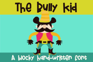
The Bully Kid: A Bold, Bouncy Font for Impactful Visual Communication
The Bully Kid is a block-like display font with subtle vertical bounce in its baseline—giving it energy without sacrificing readability or authority. It’s not a text face for body copy; it’s a tool for emphasis, hierarchy, and intention. When you need a headline to land, a poster to command attention, or a logo lockup to feel both grounded and playful, The Bully Kid delivers weight and character in equal measure. Its boldness makes it immediately legible at scale, while its slight baseline irregularity adds human rhythm—avoiding the sterility of rigid geometric sans-serifs.
Where The Bully Kid Fits in Your Design Workflow
Fonts aren’t chosen in isolation—they’re selected as part of a sequence: define the goal → understand the context → assess constraints → match voice → test execution. The Bully Kid enters most naturally at the “match voice” stage, especially when the message demands confidence, approachability, and a touch of irreverence. It works best when contrasted—paired with a neutral, highly legible sans-serif like Inter, Open Sans, or Roboto for supporting text. That pairing creates visual breathing room: The Bully Kid sets the tone; the secondary font carries the information.
For marketers launching a campaign, The Bully Kid might appear first in mood boards and creative briefs—not as final art, but as a directional signal. For educators designing workshop slides, it anchors key takeaways on title slides or infographics where retention hinges on visual anchoring. For small business owners updating their website banner or packaging, it becomes a strategic consistency lever: same font, same weight, same bounce across touchpoints.
Using The Bully Kid Before, During, and After a Project
Before: Use The Bully Kid early in concept development to test tone alignment. Drop it into low-fidelity wireframes or presentation decks to gauge whether it supports—or undermines—the intended emotional response. If your brand voice is “friendly but authoritative,” does The Bully Kid read as confident or chaotic? Does its bounce feel energetic or distracting? These aren’t aesthetic preferences—they’re functional checks before committing to higher-effort production.
During: Embed The Bully Kid into reusable design system components. In Figma or Adobe XD, create text style tokens labeled “Display / Primary Headline” that default to The Bully Kid at 48–96px, tracking –25, with line height 1.1. This ensures consistency across banners, email headers, social thumbnails, and print collateral—without manual reapplication each time. For developers integrating into websites, serve it via Google Fonts (if available) or self-host with proper @font-face declarations and fallback stacks.
After: Audit usage post-launch. Pull analytics on conversion rate, scroll depth, or engagement time for pages where The Bully Kid appears in primary headlines versus those using alternatives. Not because the font alone drives metrics—but because consistent, intentional typography correlates with perceived professionalism and clarity. If users linger longer on pages with The Bully Kid–driven headers, it may signal effective visual hierarchy—not just novelty.
Compatibility and Practical Constraints
The Bully Kid performs reliably across modern browsers and platforms—but test rigorously on iOS Safari and older Android WebView instances, where custom font rendering can vary. Its bold weight means it benefits from sufficient letter spacing at smaller sizes (<40px); avoid tight tracking in responsive contexts. Also note: it lacks extensive language support or OpenType features like stylistic sets or discretionary ligatures. It’s a focused tool—not a universal one. That’s a strength, not a limitation, if your use case centers on English-language headlines, posters, or short-form digital assets.
When exporting for print, always convert text to outlines or embed fonts fully in PDFs. For SVG exports (e.g., logos), keep paths clean—The Bully Kid’s block forms translate well to vector, but avoid scaling below 24px in raster previews, where hinting may blur its bounce.
Workflow Integration Examples
- Bloggers & Content Creators: Use The Bully Kid for featured post titles in email newsletters and Pinterest pins—where visual distinction increases click-through. Pair with a clean serif (like Merriweather) for article body text to reinforce contrast and readability.
- Educators & Trainers: Apply it to section headers in slide decks and handouts. Its bounce helps break monotony in long sessions—especially useful for workshops on creativity, growth mindset, or collaborative problem-solving.
- Freelancers & Agencies: Include The Bully Kid in your proposal templates for project phase headers (“Discovery,” “Design,” “Deliver”). It signals momentum and decisiveness—subtly reinforcing your role as a driver, not just a contributor.
- Small Business Owners: Deploy it consistently on storefront signage, menu boards, and Instagram Story highlights. Repetition builds recognition; its distinct baseline rhythm makes it memorable even at a glance.
Long-Term Use: Consistency Over Novelty
Adopting The Bully Kid isn’t about trend-following—it’s about building recognition through repetition. Think of it like a signature stamp: applied with discipline, it becomes inseparable from your output. That requires documentation. Keep a lightweight style guide—even a single Notion page or Google Doc—with clear rules: “Use only for H1 and hero section headlines,” “Never use below 32px in digital,” “Always pair with Inter Regular for body text.” Share it with collaborators, contractors, or team members who contribute to visual assets.
Also consider accessibility. While The Bully Kid itself meets contrast requirements at standard sizes, ensure surrounding UI elements (buttons, backgrounds, borders) maintain WCAG 2.1 AA compliance. Its boldness helps, but color contrast remains your responsibility—not the font’s.
What The Bully Kid Doesn’t Do (and Why That Matters)
It doesn’t replace strategy. It won’t fix weak messaging, poor layout, or misaligned branding. It won’t compensate for inconsistent spacing, mismatched colors, or unclear calls to action. Its value emerges only when paired with deliberate decisions elsewhere in the process: thoughtful content structure, user-centered layout, and purpose-driven color selection.
It also doesn’t scale infinitely. Avoid using it for multi-line paragraphs, data tables, or navigation menus. Its personality is strongest in controlled doses—like salt in cooking. Too little, and it fades. Too much, and it overwhelms. Respect its scope.
Getting Started Without Overcomplicating
Start small. Pick one recurring asset—your newsletter header, your LinkedIn banner, your workshop slide template—and swap in The Bully Kid for the main headline. Keep everything else identical. Observe how it changes perception over a week. Does it feel more assertive? More inviting? More aligned with what you’re trying to convey?
Then expand deliberately. Add it to one more context only after you’ve confirmed it reinforces—not distracts from—your core message. Document what works, what doesn’t, and why. That reflection is where real integration begins—not in installation, but in observation and iteration.
The Bully Kid isn’t magic. It’s a precision instrument: bold enough to anchor, bouncy enough to engage, simple enough to deploy without friction. Used with intention, it becomes part of your workflow’s rhythm—not an ornament, but an operational choice.